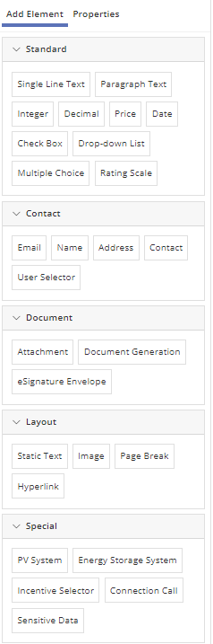
Form Field Elements
Build Data Fields in Forms to easily collect information from your users in the right format every time.

Read more about how to add, select and configure Form Elements on our Forms page. Properties such as read-only, required, conditional visibility, etc, are explained there. Only element-specific configuration properties are mentioned on this page.
In most cases, adding a new Form Field Element creates a new Data Field that will then be available to view and edit on under Program Design > Data Fields once your Form is saved. Some properties can be managed in both places. For example, as shown in the figure below, the thousands comma separator for Integer and Decimal form elements can be set in the Form Editor.

Once the field has been created, the thousands separator property for Integer or Decimal Form Elements can also be set on the Data Fields page as shown below. Editing this setting under the Data Fields page will affect all references to that field in any Form.

Standard Type Form Field Elements
- Single Line Text: Free-form text entry field useful for a range of data entry requirements such as account number, etc.
- Paragraph Text: Same as Single Line Text, but this free-form text field supports multiple lines of text.
- Integer: Whole numbers only; default, min and max values can be specified.
- Decimal: Same as integer but allows decimal expressions. Default, min and max can be specified.
- Price: Similar to Decimal; limited to two decimal places and formatted with a currency symbol (e.g. “$”).
- Date: Allows restrictions to be placed on the earliest and latest allowed dates, as well as a default. A Date data field can be populated with the current date using an automation action rule.
- Check Box: Results in a Boolean Data Field.
- Drop-Down List: List with entries specified by administrator. Restricts user to configurable set of responses. When reused on different Forms, each Form can utilize different labels for the same underlying responses.
- Multiple Choice: Same functionality as a Drop-Down List but all choices are visible at once.
- Rating Scale: Customize a left and right label and the number of items in the rating scale.
Contact Type Form Field Elements
In the Contact section, program designers can choose to add Form Field Elements such as Name, Email, Address, etc. either separately or as a packaged Data Field Group. Template Tags for the data fields created from these form elements will appear on the list of Data Fields both as individual Data Fields and as one group under the Data Field Groups tab. Add elements as a group to make it possible for all parts of that group to be added at once to a Communication or Document Template.
- Email: Requires a correct email address format.
- Name: First and Last Name fields. This element creates a Data Field Group as well as individual data fields for each sub-element.
- Address: Street (Line 1), Line 2, City, State/Province and Zip Code. This element creates a Data Field Group as well as individual data fields for each sub-element.
- Contact: Combination of: Name, Company, Address, Phone Number, and Email Address in one element. This element creates a Data Field Group as well as individual data fields for each sub-element. Each of these sub-elements can be configured as required or not required. The following Properties can be set for Contact fields: Allow “Same As” (see next paragarph below), Display Location Sub-Element, Display County Dropdown, Enable Address Autocomplete, and Enforce Phone Number Format. The phone number format enforced may vary by program locale.
“Same As” functionality allows a user to auto-fill a set of contact fields based on another contact set that was previously filled out. When selecting from a list of previously filled contact fields, users will see the Labels that were set for those fields, as shown in the figure below. - User Selector: Provides a dropdown list containing names of all PowerClerk users registered for this program, either a) with admin privileges, or b) any of a specified set of roles. This element is useful for having reviewers select their own name, for example, to keep spelling consistent and enhance reportability.

Address Autocomplete for Address Form Elements
Entering contact information can be made easier and more standardized with Address Autocomplete, a feature that allows users to select an address from a dropdown list that adjusts as they type.
In addition, program designers can request a filter to limit autocomplete suggestions to specific states or cities. This ensures that only addresses relevant to a utility’s program are shown, improving both accuracy and efficiency during the application submission process.
To enable this feature, submit a request through the PowerClerk Ticket System, and include the name(s) of the program(s) where you’d like this feature enabled. If a location filter is needed, specify the states or cities you want to restrict the autocomplete suggestions to.
- Please Note:
- Once predictive address is enabled, it will apply to all Address and Contact form elements within the program.
- The feature can be disabled for individual fields through the data field properties while editing the form.

Document Type Form Field Elements
- Attachment: For upload or viewing of previously uploaded electronic documents and photos, as well as configuration of classic eSignatures. See Document Generation and eSignature sections below for more detail.
- Document Generation: Generate documents from templates specified by the administrator with project data to simplify communications and contracts. Requires upload of a Document Template under Program Design > Document Templates.
- Signature Request: For Classic (v1) eSignature programs only. Add this element below an Attachment element to allow routing of eSignatures.
- eSignature Envelope: This element option appears if it has been enabled for this program, once at least one eSignature envelope has been configured under Program Design > eSignature Envelopes. No separate Attachment element is needed for v2 eSignature Envelopes.
For information about envelope creation, see eSignature Envelopes.
To enable v2 eSignature Envelopes or to get help migration from v1 to v2, submit a request through the PowerClerk Ticket System, and include the name(s) of the program(s) where you’d like this feature enabled.
This element allows users of the Form to preview the document to be signed, Request Signatures, and Manage Signatures, which includes Resend and Cancel options. To prevent users from re-sending requests or cancelling signatures from this location, set the element to Read Only.
Layout Type Form Field Elements
The layout elements give program designers many options for customizing the look of a Form with images, videos and static text that can be customized with HTML.
- Static Text: Text embedded into the form such as general information, instructions, or other notes. Supports some HTML formatting, including the following tags:
- “a”
- “u”, “b”, “I”, “em”, “strong”, “big”, “small”, “pre”, “sub”, “sup”, “s”, “font”
- “h1”, “h2”, “h3”, “h4”, “h5”, “h6”
- “address”
- “table”, “thead”, “tfoot”, “tbody”, “tr”, “td”, “th”
- “caption”
- “span”
- “div”
- “blockquote”
- “br”, “ul”, “li”, “ol”, “p”
- “hr”
- “#text”
- Please Note: The following attributes are allowed with strict limitations on the acceptable values for each:
- “href” = URL
- “border” = distance (a number suffixed with a unit from {“%”, “cm”, “ex”, “in”, “mm”, “pc”, “pt”, “px”})
- “width” = distance
- “height” = distance
- “cellspacing” = distance
- “cellpadding” = distance
- “target” = “_blank” or “”
- “name”
- “colspan”, “rowspan”
- “start”
- “style” = semicolon-separated style values for any of the following:
- “display”: “inline”, “block”
- “padding”: “inherit”, “initial”, four distances separated by spaces (i.e. “0 1 2 3”)
- “padding-left”: “inherit”, “initial”, distance
- “padding-right”: “inherit”, “initial”, distance
- “padding-top”: “inherit”, “initial”, distance
- “padding-bottom”: “inherit”, “initial”, distance
- “margin”: “auto”, “inherit”, “initial”, four distances separated by spaces (i.e. “0 1 2 3”)
- “margin-left”: “auto”, “inherit”, “initial”, distance
- “margin-right”: “auto”, “inherit”, “initial”, distance
- “margin-top”: “auto”, “inherit”, “initial”, distance
- “margin-bottom”: “auto”, “inherit”, “initial”, distance
- “width”: “auto”, “inherit”, “initial”, distance
- “height”: “auto”, “inherit”, “initial”, distance
- “font-family”: “inherit”, “initial”, one of a long list of fonts that we allow. Many reasonable ones are included.
- “font-size”: “medium”, “xx-small”, “xsmall”, “small”, “medium”, “large”, “x-large”, “xxlarge”, “smaller”, “larger”, “initial”, “inherit”, distance
- “font-weight”: “normal”, “bold”, “bolder”, “lighter”, “initial”, “inherit”, distance
- “color”: either a known color (e.g. “red”, “green”, “blue”, etc.) or a hexadecimal value (e.g. #00FFFF)
- “background-color”: either a known color (e.g. “red”, “green”, “blue”, etc.) or a hexadecimal value (e.g. #00FFFF)
- “list-style-type”: “lower-alpha”, “upper-alpha”, “lower-greek”, “lowerroman”, “upper-roman”, “square”, “disc”, “circle”
- “text-align”: “justify”, “center”, “left”, “right”
- “text-decoration”: “line-through”, “underline”
- Image: Allows display of a Content Library image object on a Form.
- Page Break: Separates the form into multiple pages. Each can be given a unique name by the administrator.
- Hyperlink
Embedding a Wistia Video in a Form Step by Step:
Initial Steps:
- Add a Static Text element on the desired Form.
- In the Static Text editor, add the necessary Wistia HTML (see reference below).
- Be sure to include the correct Wistia ID for the specific Wistia video.
Please Note: Wistia videos will not load on the “Edit Form” page, but they will load in the “Preview View” of a Form.

Wistia HTML Embed Example
Below is an example HTML snippet for embedding a Wistia video:

Wistia HTML Code Example:
<div class="wistia_responsive_padding" style="padding:56.25% 0 28px 0;">
<div class="wistia_responsive_wrapper" style="height:10%;width:10%;">
<div class="wistia_embed wistia_async_teew4tddn1" style="height:50%;width:50%;"> </div>
</div>
</div>
Key Highlights of this HTML:
- The key component of the embedded code is the class: wistia_async_<unique video ID>.
- In the example above, the unique video ID is teew4tddn1, resulting in the full class: wistia_async_teew4tddn1.
- A warning may appear indicating that the HTML contains potentially unsafe elements – this is expected. PowerClerk’s validation makes specific exceptions for Wistia classes, so this warning can be disregarded.
- The styling of the video container can be adjusted to better the layout and design of the form as needed.
- The feature assumes the use of Template Approach (Standard).
- PowerClerk automatically adds the necessary JavaScript bundles to the page – there is no need to add them manually.
- For more information on how to embed a Wistia Video, please see the Wistia Support Center.
Additional considerations for embedding Wistia Videos:
- Bundles: Verified Wistia bundles only get added if “wistia classes” are present in the Static Text element’s text.
- Wistia videos can be embedded on a VersaForm.
- Wistia videos can also be embedded on VersaForms loaded through VersaForm API.
- Verified Wistia videos correctly load on:
- Forms within PowerClerk site.
- Please Note: Wistia videos will not appear on the “Edit Form” page, Click Preview to ensure the video is embedded and functioning as expected. (see the figure below)
")
Special Type Form Field Elements
Elements in this section may not appear until at least one relevant data field or feature has been set up.
- PV System: A complex element that receives detailed PV system specifications and calculates projected
annual performance. Visit Distributed Energy Resource (DER) Form Elements for additional information. - Energy Storage System: The Energy Storage System form element can be used to capture stand-alone energy storage system specifications, or as a separate field in AC-Coupled scenarios where PV + Energy Storage System specifications need to be captured. Visit Distributed Energy Resource (DER) Form Elements for additional information. Please note: Contact support@powerclerk.com to have this element enabled by a CPR Admin.
- Calculated Field: Displays the result of the chosen Calculated Field. The details of the calculation can be shown under the “Show Details” link, or hidden from users of the Form if the “Show Details” toggle is turned off under the Properties tab. Calculated fields must be created under Program Design > Formulas.
- Incentive Selector: Allows selection of eligible incentives configured for the program under Program Design > Incentive Design.
- Sensitive Data: Can be used to capture and restrict access to sensitive user information, such as Social Security Numbers.
- Call Connection (previously Call Web Adapter): This element option appears if it has been enabled for the program and at least one Connection has been configured under Program Design > Connections. Integrates access to custom web services on Forms by offering a button to call a Connection.
- Custom List Group: A Custom List can be any kind of hierarchical list of data. When added to a Form, applicants can select pre-defined data from drop-down lists. Data from other columns can also be configured to appear as read-only text once the selection is made. This element appears once at least one Custom List and related Data Field Group has been set up under Program Design > Data Fields > Custom Lists.
- Table: Add a Table element to allow input of data in a tabular form element. This element appears once at least one Table has been created under Program Design > Data Fields > Data Field Groups.
- Location: Geographic coordinates of a location. Will not appear in the list unless enabled by a CPR Admin. See below for detailed information.
Location Form Element
The Location Form Element allows users to input and utilize geographic coordinates (latitude and longitude). It can operate in two modes:
- As a standalone field, where users manually enter coordinates.
- As a sub-element of an Address or Contact field, where coordinates are automatically derived from the provided address.
To enable the Location Form Element in your program, submit a request to the PowerClerk Support Inbox via the PowerClerk Ticket System and note whether it will be used as part of a PV System element.
Please Note: The interactive map currently defaults to the middle of the ocean. To request that it open to a specific location, please include the desired latitude and longitude coordinates in your request.
Utilizing the Location Form Element
The Location Form Element can be used in the following ways:
1. Coordinates for the PV System Element – Use latitude and longitude values from a Location field element instead of a ZIP code. The specified location is an input for the estimated PV production calculation.
- On the Edit Form page, within the PV System element’s properties, set the PV System Location Field property to reference a Location element. (See figure below for reference.)

2. As a Sub-Element of an Address or Contact Field – Display a map that reflects the address entered in the Form.
- While editing a Contact element on a Form, enable the Display Location Sub-Element option in the Data Field properties. Create a new Location Data Field source within the Address or Contact data field, or reference a standalone Location field. (See figures below.)


3. As standalone field – Allow users to manually enter latitude and longitude or interact with a live map.
- By default, users can manually enter latitude and longitude coordinates into the Location field. To enhance usability, there is a Display Interactive Location Map option in the field’s data properties. This adds a live map to the form, allowing users to drop a pin instead of entering coordinates manually. (See figures below.)


Video Guides
A full list of all Video Guides can also be found here.
FAQs
The correct approach to accomplish what you are intending is to create a formula that contains the constant value, then save and enable that formula, and then connect the Formula Result element in your respective form field. This way the value for this field will be properly saved.

In the example below, the administrator is specifying that the Please Describe field is only visible when the applicant selects ‘Other’ in the preceding field: “Generation Type – Prime Mover.” Naturally, if the generation type was defined in a different entry in the drop-down list, the applicant wouldn’t need to specify the generation type in a text field.

Have additional questions? Contact us to nominate your FAQ and help others find answers to your own questions concerning this feature.
Create A Support Ticket
Not finding your answer here? Submit a question to our support team at the PowerClerk Ticket System and leverage the PowerClerk team’s expertise.